Some things are just blatantly trendy and destined to be “so over” in just a few short months: The phrase “secret sauce,” Gangnam Style and those knit beard/hats to name just a few. Other things, however, are timeless and will stick around for a long time: A little black dress, Frank Sinatra songs and responsive web design.
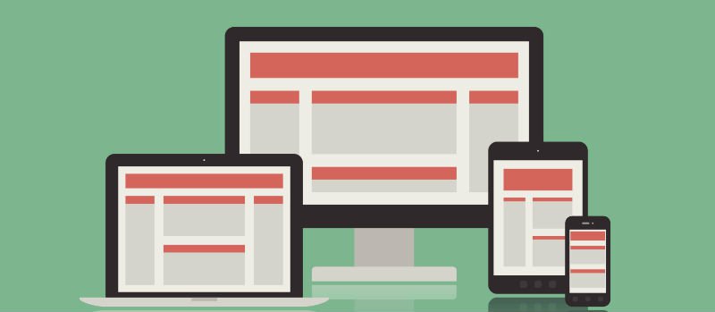
With responsive design, your website will react appropriately to the device that is accessing it (a smartphone or tablet, for example.)
When you get a website project proposal from Olive & Company, you’re likely to see the now-standard piece of advice we give to nearly everyone who will listen: Utilize a responsive approach to your website. Why?
Responsive Web Design Is the Best Way to Reach the Mobile Audience
The majority of U.S. mobile subscribers now own smartphones, according to Nielsen, and tablet sales will top laptop sales this year, according to BGR. You could ignore that fact. You could build multiple apps or separate individual sites to accommodate different devices or you could simply make your website responsive and it will accommodate multiple devices on its own. Win!
RWD Is Future-Friendly
It is impossible to keep up with the number of new devices and platforms released every year. Responsive web design ensures your site is device-agnostic and will work properly no matter what the future holds (with the possible exception of a zombie apocalypse).
RWD Makes Site Maintenance Easy
Your responsive site is a single site that can take on many forms. That means you only have to maintain one site – content only needs to be updated in one spot, there are far fewer dead ends and broken links and you’re much less likely to leave abandoned sites and apps in your wake.
RWD Is Cost-Effective
Designing a responsive site is significantly less expensive and less time consuming than designing and building several unique sites and apps for different devices.
RWD Makes for Happy Users
A study by Google in 2012 found that more than 75 percent of customers prefer a mobile-friendly site – most simply expect that your site will be responsive. RWD provides an optimized user experience and serves up the best possible site, no matter what device is used to access it.
Remember RED
Responsive Email Design accomplishes many of these same things, but to make the most of the emails you send.
While we only recommend responsive web and email design where appropriate, we do find it’s becoming more necessary to reach your audience. Give us a shout and we’ll work with you to understand your audience and your goals to determine if RWD is right for you.